
Brand identity
Alléluia Brand Identity
Create a modern, accessible and reassuring brand, capable of demystifying its own name.
- ClientAlléluia
- ScopeBrand identity
- DeliverablesLogo, monogram, typefaces, palette, stationery, website, promotional items
- Year2025
Alléluia is an exclamation, a word that conveys joy.
“For the graphic identity, we wanted to keep it simple, because the word is already very evocative.”
Sylvain Thomin, co-founder of Alléluia
The Execution
Move away from the liturgical image, lean into closeness and human warmth.
The Typography
A serif for headings, a sans-serif for text: two voices, to create a hierarchy.
Merriweather, with its serifs, is used for headings and for the portions of text to be highlighted. It announces and asserts Alléluia’s ideas loud and clear. Barlow, a sans-serif with simple shapes, carries the body text and stays legible at every size.
This contrast of structure, rather than of size or weight, is enough to set the hierarchy on every page.
Merriweather
Aa
Aa Bb Cc Dd Ee Éé Ff Gg Hh Ii Jj Kk Ll Mm Nn Oo Pp Qq Rr Ss Tt Uu Vv Ww Xx Yy Zz 0123456789
Seriousness: the editorial feel and the expertise.
Barlow
Aa
Aa Bb Cc Dd Ee Éé Ff Gg Hh Ii Jj Kk Ll Mm Nn Oo Pp Qq Rr Ss Tt Uu Vv Ww Xx Yy Zz 0123456789
Modern simplicity: accessibility and clarity.
The Palette
Navy blue is the anchor of the brand: it reassures and gives weight to ideas.
Teal and aqua bring freshness and calm. Pink brings human warmth, the same rosy light found on the portraits. Pale blue and very pale pink serve as backgrounds to let the pages breathe. Black and white stay in the service of reading.
The anchor
Navy
#002346
The blues
Teal
#135B64
Aqua
#4EA19E
Pale blue
#D6EEF0
The pinks
Pink
#CA748A
Pale pink
#EDCFD1
Very pale pink
#FEF3F7
Black and white
Black
#000000
White
#FFFFFF
The Logo
Two staggered l’s, like two partners passing the ball back and forth.
The first two l’s in Alléluia are Sylvain and David. They don’t think alike, and that is what makes the team strong.
“One idea goes out, the other sends it back.”
David Lamarche, art director and co-founder of Alléluia
The offset lends itself to other readings. Notes rising, like the melody of a sung alleluia. A curve climbing, like the growth we wish for our clients. One simple logo, several ways to read it.
The Monogram
The whole agency in a single mark.
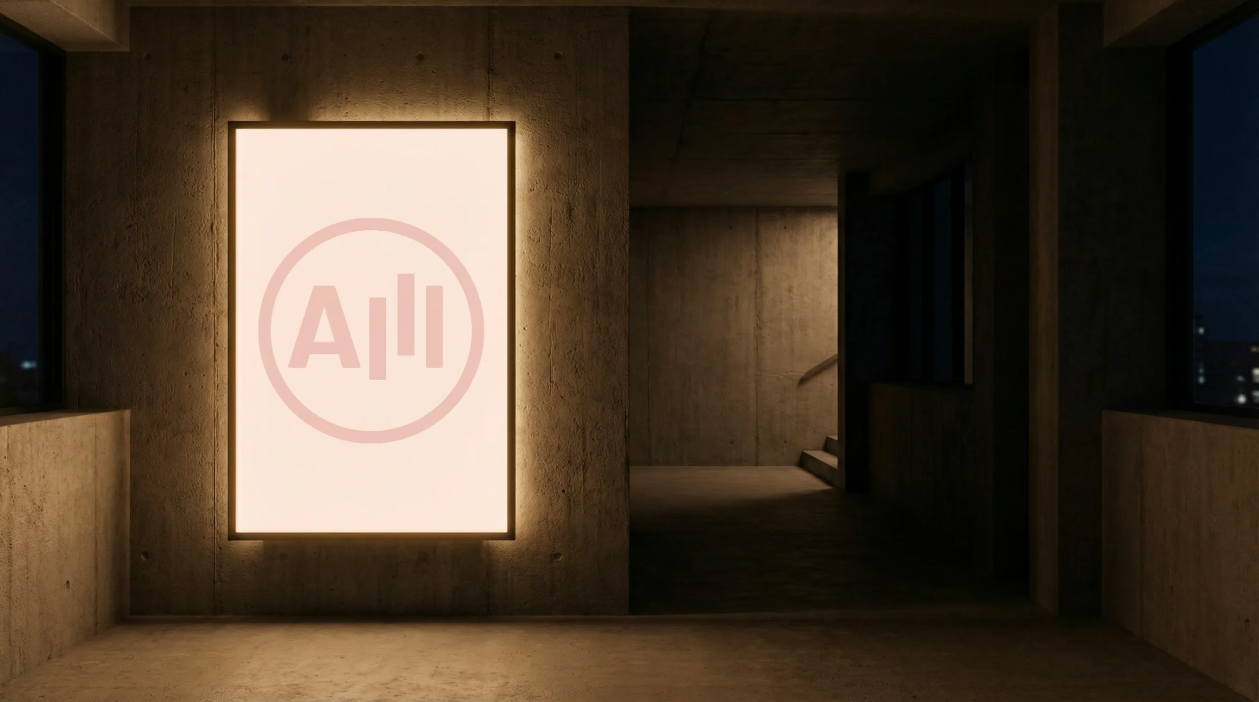
A name doesn’t fit everywhere. On a browser tab, a profile photo or a button, the monogram takes over. The logo’s staggered l’s become three bars in motion.
The Tone
Irreverence can be relevant.
Alléluia speaks the way people who trust each other speak: directly, with no detours. Its headlines dare a touch of insolence without ever sliding into cynicism, and always prefer the clever line to the one that oversells.
The Applications
A simple brand, because the word is already very evocative.



The Photographic Approach
The rosy light on the face is the creative spark.
A contrast that shows a living agency, where people are literally put in the spotlight by creativity.


We make ads people love.
Who could be against that?
Next project
